# Load the required libraries, suppressing annoying startup messages
library(tibble)
suppressPackageStartupMessages(library(dplyr))
# Read the mtcars dataset into a tibble called tb
data(mtcars)
tb <- as_tibble(mtcars)
# Convert relevant columns into factor variables
tb$cyl <- as.factor(tb$cyl) # cyl = {4,6,8}, number of cylinders
tb$am <- as.factor(tb$am) # am = {0,1}, 0:automatic, 1: manual transmission
tb$vs <- as.factor(tb$vs) # vs = {0,1}, v-shaped engine, 0:no, 1:yes
tb$gear <- as.factor(tb$gear) # gear = {3,4,5}, number of gears
# Directly access the data columns of tb, without tb$mpg
attach(tb)Continuous x Continous data (2 of 2)
Aug 7, 2023.
Exploring bivariate Continuous x Continuous data, using ggplot2
THIS CHAPTER demonstrates the use of the popular ggplot2 package to further explore the interaction between bivariate continuous data.
Data: Suppose we run the following code to prepare the mtcars data for subsequent analysis and save it in a tibble called tb.
Scatterplot using ggplot2
# Load the ggplot2 package
library(ggplot2)
Attaching package: 'ggplot2'The following object is masked from 'tb':
mpg# Create the scatter plot
ggplot(tb, aes(x = wt, y = mpg)) +
geom_point() +
xlab("Weight (1000 lbs)") +
ylab("Miles per gallon") +
ggtitle("Scatter Plot of Weight vs. MPG")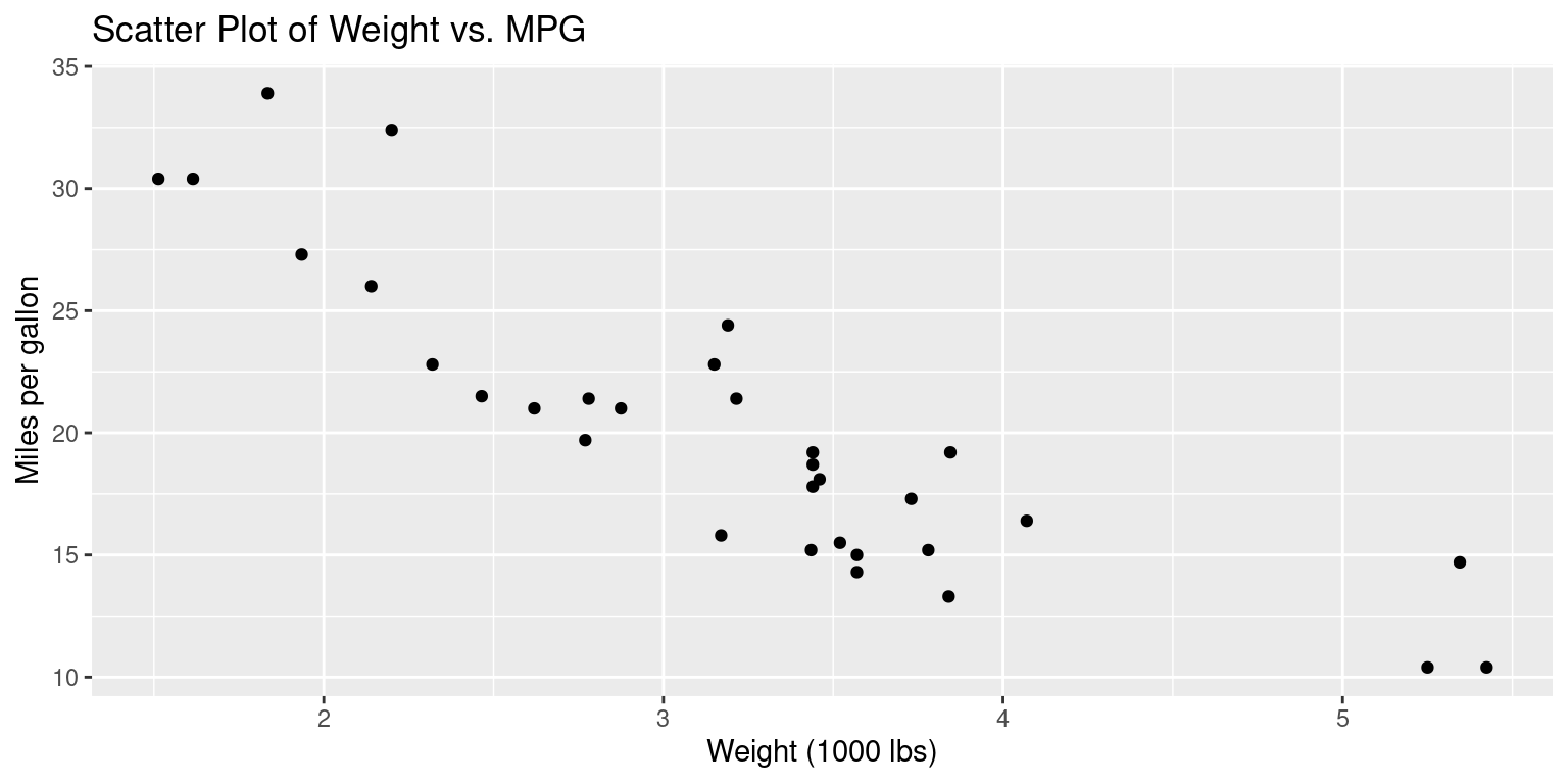
This code creates a scatter plot of the wt variable (weight in 1000 lbs) on the x-axis and the mpg variable (miles per gallon) on the y-axis. The geom_point() function is used to add the points to the plot, and xlab(), ylab(), and ggtitle() are used to add axis labels and a plot title, respectively. You can adjust the aesthetics of the plot, such as the color and size of the points, by adding additional arguments to the geom_point() function.
Scatterplot Matrix
Recall that a scatter plot matrix (also called a pairs plot or a SPLOM) is a graphical display of pairwise scatter plots of a set of variables. In a scatter plot matrix, each variable in the dataset is plotted against every other variable in a matrix format. This allows us to visualize the relationships between pairs of variables and explore potential patterns or trends in the data.
A scatter plot matrix is particularly useful for exploring multivariate datasets, as it allows us to quickly identify which pairs of variables may be strongly correlated, which may have weak or no correlation, and which may exhibit nonlinear relationships. It can also be used to identify outliers or unusual observations, and to visualize clusters or groups of observations based on patterns in the scatter plots.
Scatterplot Matrix Using ggpairs()
# Load the GGally package
library(GGally)

# Create a scatterplot matrix using ggpairs()
ggpairs(tb[,c("mpg","wt","hp","drat")])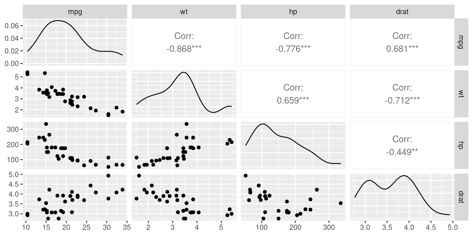
Scatterplots broken down by Categorical Variables
Scatterplot with colored by Categorical Variable Using ggplot()
This will create a scatterplot of miles per gallon (mpg) against weight, with each point colored according to the number of cylinders in the engine (cyl).
# Load the ggplot2 package
library(ggplot2)

# Create a scatterplot of mpg vs. wt, colored by cyl
ggplot(tb, aes(x = wt, y = mpg, color = factor(cyl))) +
  geom_point() +
  labs(x = "Weight (lbs/1000)", y = "Miles per gallon") +
  scale_color_discrete(name = "Cylinders")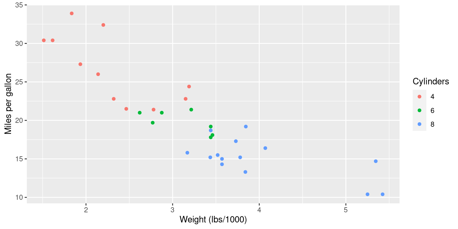
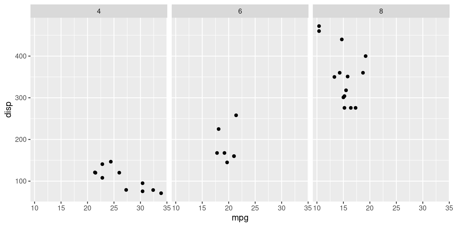
Scatterplot with broken down by Categorical Variable Using ggplot()
This will create a scatterplot of miles per gallon (mpg) against weight, with each plot faceted by the number of cylinders in the engine (cyl).
# Load the ggplot2 package
library(ggplot2)

# Create a scatterplot matrix using ggplot()
ggplot(tb, aes(x = mpg, y = disp)) +
  geom_point() +
  facet_grid(. ~ cyl)