
color <- c("red", "blue", "green", "red", "green", "yellow")
color_factor <- factor(color)Categorical Data
Aug 4, 2023
Exploring Univariate Categorical Data
THIS CHAPTER explores how to summarize and visualize univariate, categorical data.
Categorical data is a type of data that can be divided into categories or groups. labels or categorical codes like “male” and “female,” “red,” “green,” and “blue,” or “A,” “B,” and “C” are frequently used to describe category data. This data type is commonly employed in research and statistics where you can categorize the data under various headings depending on their features, characteristics, or any other parameters [1]
There are several typical examples of categorical data.:
- Gender (male, female)
- Marital status (married, single, divorced)
- Education level (high school, college, graduate school)
- Occupation (teacher, doctor, engineer)
- Hair color (brown, blonde, red, black)
- Eye color (brown, blue, green, hazel)
- Type of car (sedan, SUV, truck) [2]
Types of Categorical Data – Nominal, Ordinal Data
`Nominal data`: This data type is characterized by variables that have two or more categories without having any kind of order or priority. This name-based categorization means that nominal data represents whether a variable belongs to a certain category or not, but it does not convey any qualitative value about the variable itself. For example, ‘gender’ is a nominal data type, as it categorizes data into ‘male’ or ‘female’, and neither category is intrinsically superior to the other (Agresti, 2018). Nominal data is usually represented by text labels or categorical codes.
`Ordinal data`: Unlike nominal data, ordinal data categories have an inherent order. This order, however, does not provide any information about the exact differences between the categories. Common examples of ordinal data include the Likert scale in surveys, which ranges from “very dissatisfied” to “very satisfied,” or clothing sizes, which are typically “small,” “medium,” or “large.” While we know that “large” is bigger than “medium” and “medium” is bigger than “small,” we don’t know exactly how much bigger one is compared to the other (McCrum-Gardner, 2008).
- Ordinal data is frequently utilised to describe groups or categories that can be rated or sorted, such as educational level {high school, college, graduate school}, or movie reviews {G, PG, PG-13, R, NC-17}. [2]
Factor Variables in R
“Factor” is a term specifically used in R programming language to handle categorical data. Factors are the data objects which are used to categorize the data and store it as levels. They can store both strings and integers. They are useful in data analysis for statistical modeling. (Wickham & Grolemund, 2016).
A factor variable has levels, which are the distinct categories of the variable. For instance, if we have a factor variable named “color”, the levels might be “red,” “blue,” and “green.” Each level corresponds to a category in the categorical data. Creation of a factor variable in R can be done as follows:
- In this example,
color_factoris a factor variable with four levels - “red”, “blue”, “yellow” and “green”.
levels(color_factor)[1] "blue" "green" "red" "yellow"- Now consider the
mtcarsdataset, read into a tibbletb. The following code prepares a tibble of car attributes for analysis, converting several of the variables into categorical data types using the factor structure in R.
# Load the required libraries, suppressing annoying startup messages
library(tibble)
suppressPackageStartupMessages(library(dplyr))
# Read the mtcars dataset into a tibble called tb
data(mtcars)
tb <- as_tibble(mtcars)
attach(tb)# Convert several numeric columns into factor variables
tb$cyl <- as.factor(tb$cyl)
tb$vs <- as.factor(tb$vs)
tb$am <- as.factor(tb$am)
tb$gear <- as.factor(tb$gear)- The above code reads the
mtcarsdata into a tibble namedtband transforms certain variables from the tibble into factors (categorical variables), using theas.factor()function. Specifically, thecyl(cylinders),vs(engine shape),am(transmission type), andgear(number of gears) variables are transformed into factors. This change is useful for subsequent analyses that need to recognize these variables as categorical data, rather than numerical data.
Analysis of a univariate Factor Variable
Recall that in the
mtcarsdataset,cylstands for the number of cylinders in the car’s engine. By transformingcylinto a factor variable, we’re recognizing it as a categorical variable, which means we’re acknowledging that it consists of several distinct categories or levels (Wickham & Grolemund, 2016). Each category or level corresponds to a specific number of cylinders a car might have.Notice that in order to convert
cylinto a factor variable in R, we have used the following line of code, which modifies thecylcolumn in the mtcars data frame (or tibble), transforming it from a numerical variable into a factor variable.
tb$cyl <- as.factor(tb$cyl)- As a univariate factor variable,
cylrepresents a single, categorical characteristic of each car in the mtcars dataset: the number of cylinders in the engine. In this context, “univariate” means that we’re only considering one variable at a time, without reference to any other variables (Sheskin, 2011). In the case ofcyl, the unique categories (or levels) would correspond to the different numbers of cylinders in the cars’ engines. The following R code give us the levels ofcyl.
levels(tb$cyl)[1] "4" "6" "8"This code could be alternately written as follows, giving the same result:
tb$cyl %>% levels()- The
levels()function retrieves the levels of a factor variable. When it is applied to tb$cyl in the given context, it provides the unique categories of thecylfactor variable from the tb tibble, which are “4”, “6”, and “8”. These values correspond to the distinct number of cylinders in the cars’ engines that are represented in the mtcars dataset (Wickham & Grolemund, 2016).
Summarizing a univariate Factor Variable
Frequency Table: A simple way to summarize categorical (or factor) data is by using a frequency table. It represents the count (frequency) of each category (level) in the factor variable. Essentially, a frequency table gives us a snapshot of the data distribution by indicating how many data points fall into each category (Crawley, 2007).
In R, we can create a frequency table using the
table()function. For example, to create a frequency table for thecylvariable in the tb tibble, we could write the following code whose output shows the number of cars that fall into eachcylcategory (4, 6, or 8 cylinders).
table(tb$cyl)
 4  6  8
11  7 14
This code could be alternately written as follows, giving the same result:
tb$cyl %>% table()Here’s how it works:
tb$cyl: This piece of code is specifying the cyl column in the tb tibble, where cyl represents the number of cylinders in the car’s engine.
%>% table(): The output of tb$cyl (i.e., the cyl column of tb) is then passed to the table() function via the pipe operator%>%. The table() function creates a frequency table of the cyl column, counting the number of occurrences of each level (i.e., each distinct number of cylinders).
- Proportions: In contrast to the
table()function, which generates a count of each category, theprop.table()function gives the proportions of each category. The subsequent code computes the proportions of each unique count of cylinders in thecylcolumn from thetbtibble.
tb$cyl %>%
  table() %>%
  prop.table()
.
4 6 8
0.34375 0.21875 0.43750 %>% prop.table(): The output of table(), a frequency table, is passed to the prop.table() function. This function converts the frequency table into a proportion table, showing the proportion of the total for each level rather than the raw count.
This code could be alternately written as follows, giving the same result.
p0 = prop.table(table(cyl))
p0
The prop.table() function is used in this example to determine the percentage of each category in the cyl variable of the mtcars dataset. For example, we find that the proportion of cars with 4 cylinders are 0.34375.
- Percentages: Suppose we wanted to express the proportions as percentages, rounded to two decimal places. We could calculate the percentages using the
round()function, as follows:
tb$cyl %>%
  table() %>%
  prop.table() %>%
  `*`(100) %>%
  round(digits = 2) %>%
  paste0("%")
[1] "34.38%" "21.88%" "43.75%"Here’s how it works:
%>%*(100): Multiplies these proportions by 100, effectively converting them to percentage format.
%>% round(digits = 2): Rounds these percentages to two decimal places.
%>% paste0("%"): Concatenates a % symbol to denote percentages .
The final output will be a table displaying the percentage of cars that have 4, 6, and 8 cylinders, respectively. Each percentage is rounded to two decimal places. The proportion of each category or group of categories, rounded to two decimal places, is presented. For instance, 43.75% of automobiles have 8 cylinders.
Visualization of a univariate Factor Variable
Barplot
The barplot() function in base R can be used to create a simple bar plot. We usually feed it a frequency table, which can be created with the table() function. Here’s an example of how to create a bar plot for the cyl variable:
# Create a table of the counts of cars by number of cylinders
cyl_table <- table(tb$cyl)

# Create a barplot of the table
barplot(cyl_table,
        main = "Number of cars by cylinder count",
        xlab = "Cylinders",
        ylab = "Number of cars",
        col = "gold")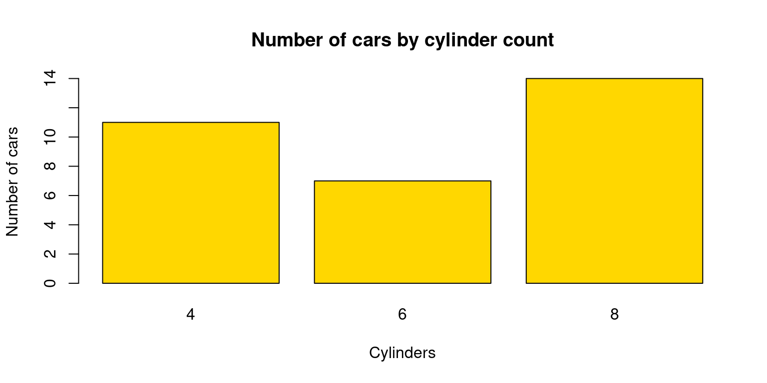
In this code, table(tb$cyl) creates a frequency table for the cyl variable. The xlab, ylab, and main arguments are used to set the x-axis label, y-axis label, and the plot title, respectively. The color of the bars can be altered with the col option.
Pie chart
Pie charts can be created with the pie() function in base R. Just like with barplot(), we typically provide a frequency table to pie().
Here’s how to create a pie chart for the cyl variable:
# Count the number of cars with each number of cylinders
cyl_counts <- table(mtcars$cyl)

# Create a pie chart
pie(cyl_counts,
    main = "Pie Chart of Cars by Number of Cylinders",
    labels = c("4 cylinders", "6 cylinders", "8 cylinders"),
    col = c("red", "green", "blue"))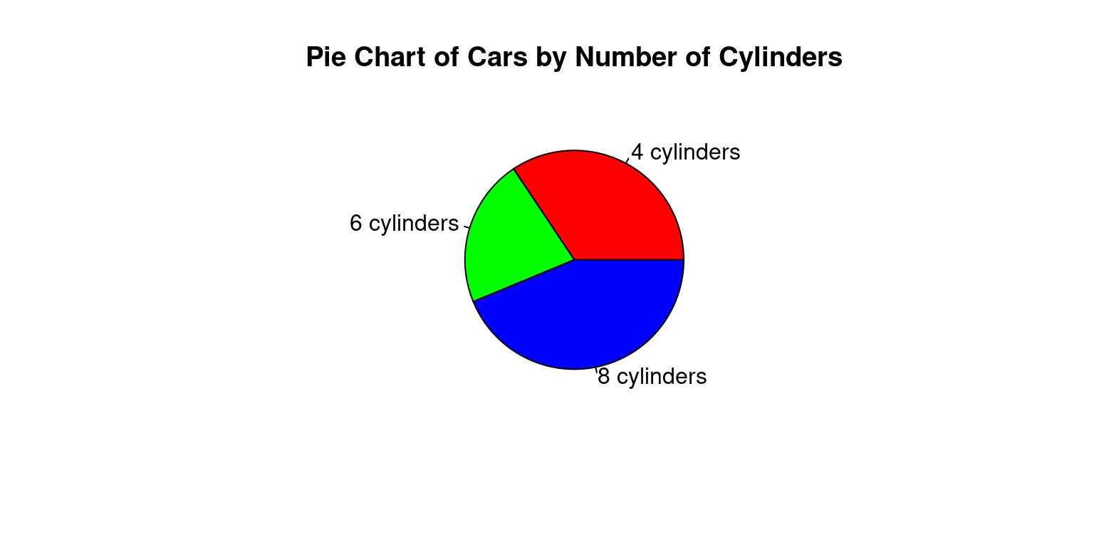
Alternately, if we wanted to display the percentages, we could write the following code:
# Count the number of cars with each number of cylinders
cyl_counts <- table(mtcars$cyl)
percentages <- round(prop.table(table(tb$cyl))*100, 2)
mylabels <- paste(percentages, "%")

# Create a pie chart
pie(cyl_counts,
    main = "Pie Chart of Cars by Number of Cylinders",
    labels = mylabels)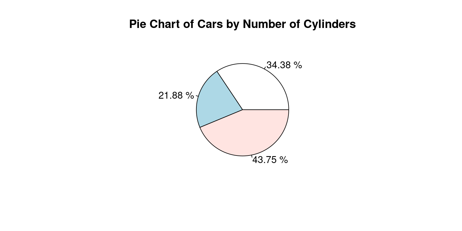
Here is how it works:
percentages <- round(prop.table(table(tb$cyl))*100, 2): This line calculates the proportions of each unique number of cylinders, multiplies these proportions by 100 to convert them into percentages, and rounds these percentages to two decimal places. The resulting percentages are saved to the percentages variable.
mylabels <- paste(percentages, "%"): This line creates labels for each slice of the pie chart. These labels are made up of the percentages calculated in the previous step, followed by a percentage sign (%). The labels are saved to a mylabels variable.
The pie() function then creates a pie chart using the frequency counts (cyl_counts) and the labels (mylabels). The main argument is used to set the title of the pie chart.
While both bar plots and pie charts can be used to visualize the same data, they each have their strengths and limitations. Bar plots are typically better for comparing absolute counts or proportions across levels, whereas pie charts may be more intuitive when demonstrating the part-whole relationship (Heiberger & Robbins, 2014).
Visualization of a univariate Factor data using ggplot2 package
Overview of ggplot2 package
The ggplot2 package, part of the tidyverse collection of R packages, is a powerful and flexible tool for creating a wide range of visualizations in R (Wickham, 2016). It is built on the principles of the Grammar of Graphics (Wilkinson, 2005), which provides a coherent system for describing and building graphs.
At the heart of ggplot2 is the idea of mapping data to visual elements. This approach encourages you to think about the relationship between your data and the visual representation, making it easier to create complex and customized graphs.
Key elements of ggplot2 include:
- Data: The data frame that is to be visualized.
- Aesthetics: These are mappings from data to visual elements (like position, color, and size).
- Geoms: Geometric objects that represent the data (like points, lines, and bars).
- Scales: These control how data values are translated to visual elements.
- Facets: For creating multiple sub-plots, each showing a subset of the data.
In a ggplot2 graph, these elements are combined in layers, enabling a high degree of customization. [10]
Bar Plot using ggplot2 package
Here is an example of how to use ggplot2 to create a bar plot of the cyl variable:
library(ggplot2)
Attaching package: 'ggplot2'The following object is masked from 'tb':
mpgggplot(data = tb,
aes(x = cyl)) +
geom_bar(aes(fill = cyl)) +
labs(title = "Bar Plot of Cylinders",
x = "Cylinders",
y = "Count")
Here is how it works:
library(ggplot2): This line loads the ggplot2 package into your R session. The ggplot2 package provides a powerful framework for creating diverse and sophisticated graphics in R.
ggplot(data = tb, aes(x = cyl)) +: This line initiates the creation of a ggplot object. The ggplot() function takes as arguments the data frame to use (tb in this case) and an aesthetics mapping function aes(), which maps the cyl variable to the x-axis of the plot. The + sign indicates that more layers will be added to this initial ggplot object.
geom_bar() +: This line adds a layer to the ggplot object to create a bar plot. The geom_bar() function by default will create a bar plot where the height of the bars corresponds to the count of each category in the data.
labs(title = "Bar Plot of Cylinders", x = "Cylinders", y = "Count"): This line adds labels to the plot. The labs() function is used to set the title of the plot and the labels for the x and y axes. The title of the plot is set as “Bar Plot of Cylinders”, the x-axis is labeled as “Cylinders”, and the y-axis is labeled as “Count”.
So, to summarize, this code is loading the ggplot2 package, initializing a ggplot object with data from the tb tibble and mapping the cyl variable to the x-axis, adding a bar plot layer to the ggplot object, and finally adding a title and labels to the x and y axes.
Suppose we wanted to add labels to the bars showing the count of each category. We can do this by using the geom_text() function in ggplot2. Here’s how we can modify our code to include labels:
ggplot(data = tb, aes(x = cyl)) +
  geom_bar(aes(fill = cyl)) +
  geom_text(stat='count',
            aes(label=after_stat(count)),
            vjust=-0.5) +
  labs(title = "Bar Plot of Cylinders",
       x = "Cylinders",
       y = "Count")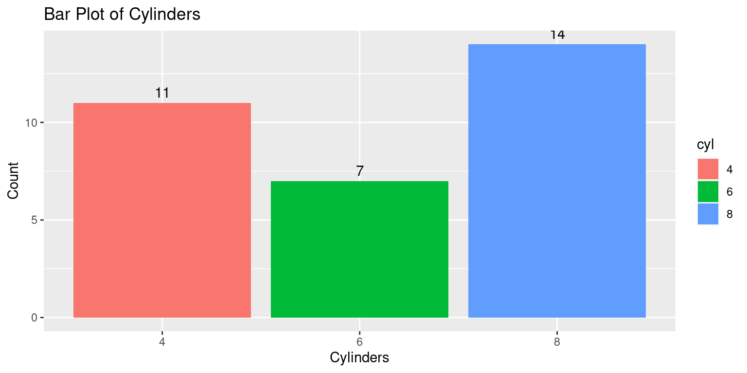
Here’s a breakdown of the new line of code:
geom_text(stat='count', aes(label=after_stat(count)), vjust=-0.5): This line adds a text layer to the plot. The after_stat(count) argument tells geom_text() to calculate the count of each category, and aes(label=after_stat(count)) maps these counts to the text labels. The vjust=-0.5 argument adjusts the vertical position of the labels to be slightly above the top of each bar.
We can also customize the appearance of the text labels using the various arguments to geom_text(), such as size, color, fontface, and so on. [10]
Pie chart using ggpie
Aside: Unfortunately, the ggplot2 package doesn’t directly support pie charts, because they are generally not as effective at displaying data as other types of plots.
The ggpie() function is part of the ggpubr package in R, a package that provides a set of functions to enhance the visual appeal and usability of ggplot2 plots (Kassambara, 2020).
The ggpie() function specifically enables the creation of pie charts within the ggplot2 framework.
The ggpie() function accepts the following key arguments:
data: The data frame containing the variables to be used in the pie chart.x: The variable in the data frame that determines the size (area) of the pie slices.fill: The variable that determines the fill color of the pie slices.label: The variable to use for the labels of the slices.Additional aesthetic details like the title of the chart, color palette, and other ggplot2 functionalities like adding layers, changing themes, etc., can also be utilized with
ggpie().
Let us use ggpie() to create a boxplot of cyl.
library(ggpubr)

# Compute counts of each cylinder type
cyl_counts <- as.data.frame(table(tb$cyl))
colnames(cyl_counts) <- c("cyl", "n")

# Create the pie chart
ggpie(data = cyl_counts,
      x = "n",
      fill = "cyl",
      label = "cyl",
      palette = "jco",
      title = "Pie Chart of Cylinders")
Here is how it works:
The library(ggpubr) line loads the ggpubr package. This package contains the ggpie function which is used to create pie charts in ggplot2.
The command table(tb$cyl) calculates the frequency of each type of cyl (cylinders) present in the tb dataset. as.data.frame() is then used to convert this table into a data frame, which is stored in the cyl_counts object. The column names of cyl_counts are then set to “cyl” and “n” using the colnames() function.
The ggpie() function is used here to generate a pie chart. The arguments to ggpie() specify the data frame (data = cyl_counts), the variable that determines the size of the pie slices (x = "n"), the variable that determines the fill color of the slices (fill = "cyl"), the variable used for the labels of the slices (label = "cyl"), the color palette (palette = "jco"), and the title of the chart (title = "Pie Chart of Cylinders").
This code results in a pie chart where each slice represents a different number of cylinders (cyl), the size of each slice is determined by the frequency of each number of cylinders (n), and the color of each slice is determined by the number of cylinders (cyl). The labels for each slice also represent the number of cylinders, and the color palette jco is used for the colors of the slices. [10]
If we wanted to instead display the percentages for each pie, we could modify this code as follows:
# Load the ggpubr package
library(ggpubr)

# Compute counts and proportions of each cylinder type
cyl_counts <- as.data.frame(table(tb$cyl))
colnames(cyl_counts) <- c("cyl", "n")

# Calculate proportions
cyl_counts$prop <- cyl_counts$n / sum(cyl_counts$n)

# Create labels that display proportions as percentages
cyl_counts$labels <- paste0(round(cyl_counts$prop*100, 2), "%")

# Create the pie chart with proportions
ggpie(data = cyl_counts,
      x = "prop",
      fill = "cyl",
      label = "labels",
      palette = "jco",
      title = "Pie Chart of Cylinders")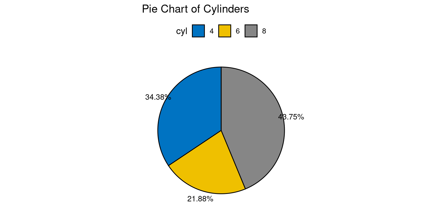
This version of the code calculates the proportion of each cylinder type by dividing the count of each type by the total count i.e., cyl_counts$n / sum(cyl_counts$n). These proportions are then stored in a new column in the cyl_counts data frame. Labels are created that display these proportions as percentages, and these labels are used in the pie chart instead of the raw counts. The x argument in ggpie() is updated to use these proportions, so the size of each slice in the pie chart corresponds to the proportion of each cylinder type.
Summary of Chapter 8 – Categorical Data (1 of 3)
In this chapter, we explored the fundamental concept of categorical data and its two primary types: nominal and ordinal data. Categorical data involves organizing information into distinct categories or groups using labels or codes, making it a crucial data type in various fields, including research, statistics, and data analysis.
We delved into nominal data, which represents variables with categories that lack any inherent order or hierarchy. Examples such as gender (male, female), marital status (married, single, divorced), and hair color (brown, blonde, red, black) exemplify nominal data. These categories are characterized by their name-based grouping, without conveying any intrinsic quantitative information. Next, we discussed ordinal data, which differs from nominal data by possessing categories with a specific order or ranking, but without exact quantitative distinctions. The Likert scale used in surveys (ranging from “very dissatisfied” to “very satisfied”) and clothing sizes (small, medium, large) are instances of ordinal data. While we can determine the order, we lack precise knowledge of the differences between categories.
Factor variables in R played a significant role in the chapter, as they are essential for handling and storing categorical data. Factor variables allow us to map levels to distinct categories, facilitating efficient data organization and manipulation. We learned how to create factor variables in R using the factor() function, which was then applied to the mtcars dataset.
Additionally, we explored the analysis of univariate factor variables in R, focusing on summarizing the data through frequency tables. These tables provided counts of each category, allowing us to understand the distribution of categorical data better. Moreover, we computed proportions and percentages to gain a more insightful view of the data distribution, enhancing the interpretation of results.
The chapter proceeded to introduce powerful visualization techniques for univariate factor variables using the ggplot2 package. As part of the tidyverse collection of R packages, ggplot2 is known for its flexibility and capability to create diverse and customizable visualizations. We specifically looked at creating bar plots using ggplot2. By utilizing the ggplot() function to initialize a ggplot object and the aes() function to map the factor variable to the x-axis, we effectively represented categorical data. The geom_bar() function enabled the generation of bar plots, while geom_text() facilitated the addition of count labels for each category, enhancing the visual representation.
Although ggplot2 does not natively support pie charts due to their limited effectiveness in data visualization, we introduced the ggpie() function from the ggpubr package as an alternative. Using ggpie(), we demonstrated how to create pie charts within the ggplot2 framework. The function allowed us to represent proportions or percentages as slices in the pie chart, providing a comprehensive understanding of the distribution of the categorical data.
References
[1] Diez, D. M., Barr, C. D., & Çetinkaya-Rundel, M. (2012). OpenIntro Statistics (2nd ed.). OpenIntro.
[2] Agresti, A. (2018). An Introduction to Categorical Data Analysis (3rd ed.). Wiley.
[3] Sheskin, D. J. (2011). Handbook of Parametric and Nonparametric Statistical Procedures (5th ed.). Chapman and Hall/CRC.
Wickham, H., & Grolemund, G. (2016). R for Data Science: Import, Tidy, Transform, Visualize, and Model Data. O’Reilly Media.
Agresti, A. (2007). An Introduction to Categorical Data Analysis (2nd ed.). Wiley.
Crawley, M. J. (2007). The R Book. Wiley.
Healy, K., & Lenard, M. T. (2014). A practical guide to creating better looking plots in R. University of Oregon. https://escholarship.org/uc/item/07m6r
Few, S. (2004). Show me the numbers: Designing tables and graphs to enlighten. Analytics Press.
Friendly, M. (1994). Mosaic displays for multi-way contingency tables. Journal of the American Statistical Association, 89(425), 190-200.
Heiberger, R. M., & Robbins, N. B. (2014). Design of diverging stacked bar charts for Likert scales and other applications. Journal of Statistical Software, 57(5), 1-32. doi: 10.18637/jss.v057.i05.
[10]
Wickham, H. (2016). ggplot2: Elegant Graphics for Data Analysis. Springer-Verlag New York. ISBN 978-3-319-24277-4, https://ggplot2.tidyverse.org.
Wilkinson, L. (2005). The Grammar of Graphics (2nd ed.). Springer-Verlag.
Alboukadel Kassambara (2020). ggpubr: ‘ggplot2’ Based Publication Ready Plots. R package version 0.4.0. https://CRAN.R-project.org/package=ggpubr