
# Load the required libraries, suppressing annoying startup messages
library(tibble)
suppressPackageStartupMessages(library(dplyr))
# Read the mtcars dataset into a tibble called tb
data(mtcars)
tb <- as_tibble(mtcars)
# Convert relevant columns into factor variables
tb$cyl <- as.factor(tb$cyl) # cyl = {4,6,8}, number of cylinders
tb$am <- as.factor(tb$am) # am = {0,1}, 0:automatic, 1: manual transmission
tb$vs <- as.factor(tb$vs) # vs = {0,1}, v-shaped engine, 0:no, 1:yes
tb$gear <- as.factor(tb$gear) # gear = {3,4,5}, number of gears
# Directly access the data columns of tb, without tb$mpg
attach(tb)Continuous x Categorical data (2 of 2)
Aug 7, 2023
THIS CHAPTER explores Continuous x Categorical data using the
ggplot2package. Specifically, it demonstrates the use ofggplot2package to further explore bivariate continuous data across categories.Data: Suppose we run the following code to prepare the
mtcarsdata for subsequent analysis and save it in a tibble calledtb.
Summarizing Continuous Data using ggplot2
Across one Category using ggplot2
- We demonstrate the bivariate relationship between Miles Per Gallon (
mpg) and Cylinders (cyl) usingggplot2.
library(dplyr)
s1 <- tb %>%
  group_by(cyl) %>%
  summarise(Mean_mpg = mean(mpg, na.rm = TRUE),
            SD_mpg = sd(mpg, na.rm = TRUE))
print(s1)
# A tibble: 3 × 3
cyl Mean_mpg SD_mpg
<fct> <dbl> <dbl>
1 4 26.7 4.51
2 6 19.7 1.45
3 8 15.1 2.56- Discussion:
In this code, we use the pipe operator
%\>%to perform a series of operations. We first group the data by thecylcolumn using thegroup_by()function. We then usesummarise()to apply themean()andsd()functions to thempgcolumn.The results are stored in new columns, aptly named
Mean_mpgandSD_mpg.We set
na.rm = TRUEin bothmean()andsd()function calls, to remove any missing values before calculation. [1]
- Visualizing the mean and standard deviation
The data resulting from the above code consists of grouped cylinder counts (
cyl), their corresponding mean miles per gallon (Mean_mpg), and the standard deviation of miles per gallon (SD_mpg).A simple way to visualize this data would be to create a line plot for the mean miles per gallon with error bars to indicate standard deviation. Here is an example of how we could do this with
ggplot2:
library(ggplot2)
Attaching package: 'ggplot2'The following object is masked from 'tb':
mpgggplot(s1,
aes(x = cyl, y = Mean_mpg)) +
geom_line(group=1, color = "blue") +
geom_point(size = 2, color = "red") +
geom_errorbar(aes(ymin = Mean_mpg - SD_mpg,
ymax = Mean_mpg + SD_mpg),
width = .2, colour = "black") +
labs(x = "Cylinders", y = "Mean mpg") +
theme_minimal()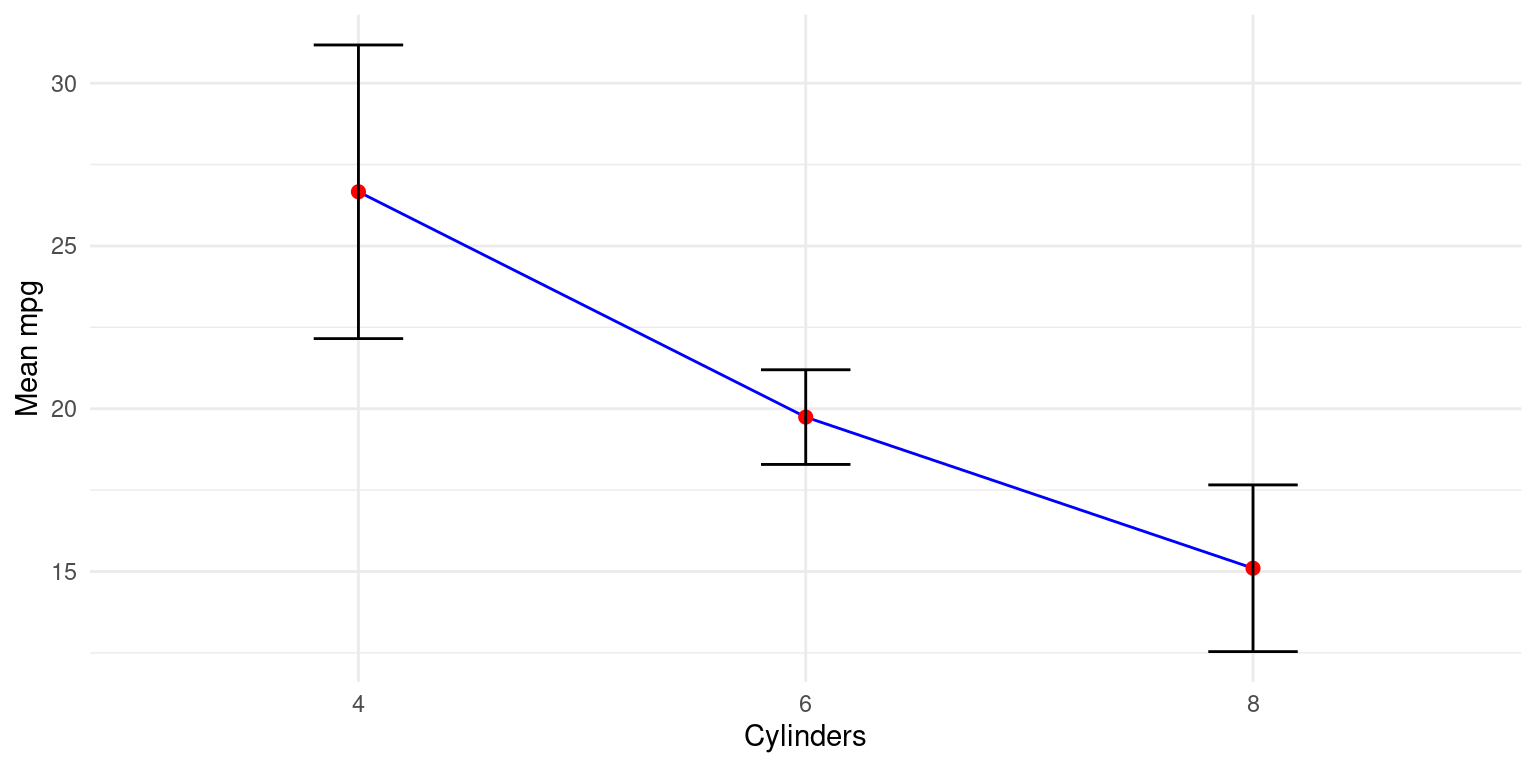
- Discussion:
aes(x = cyl, y = Mean_mpg)assigns thecylvalues to the x-axis andMean_mpgto the y-axis.geom_line(group=1, color = "blue")adds a blue line connecting the data points.geom_point(size = 2, color = "red")adds red points for each data point.geom_errorbar(aes(ymin = Mean_mpg - SD_mpg, ymax = Mean_mpg + SD_mpg), width = .2, colour = "black")adds error bars, where the error is the standard deviation.The
yminandymaxarguments define the range of the error bars.labs(x = "Cylinders", y = "Mean mpg")labels the x and y axes.theme_minimal()applies a minimal theme to the plot.
- Alternate visualization:
library(ggplot2)

# mpg plot
ggplot(s1, aes(x = cyl, y = Mean_mpg)) +
  geom_bar(stat = "identity",
           fill = "gold",
           alpha = 0.7) +
  geom_errorbar(aes(ymin = Mean_mpg - SD_mpg,
                    ymax = Mean_mpg + SD_mpg),
                width = .2) +
  labs(x = "Cylinders", y = "Mean mpg") +
  theme_minimal()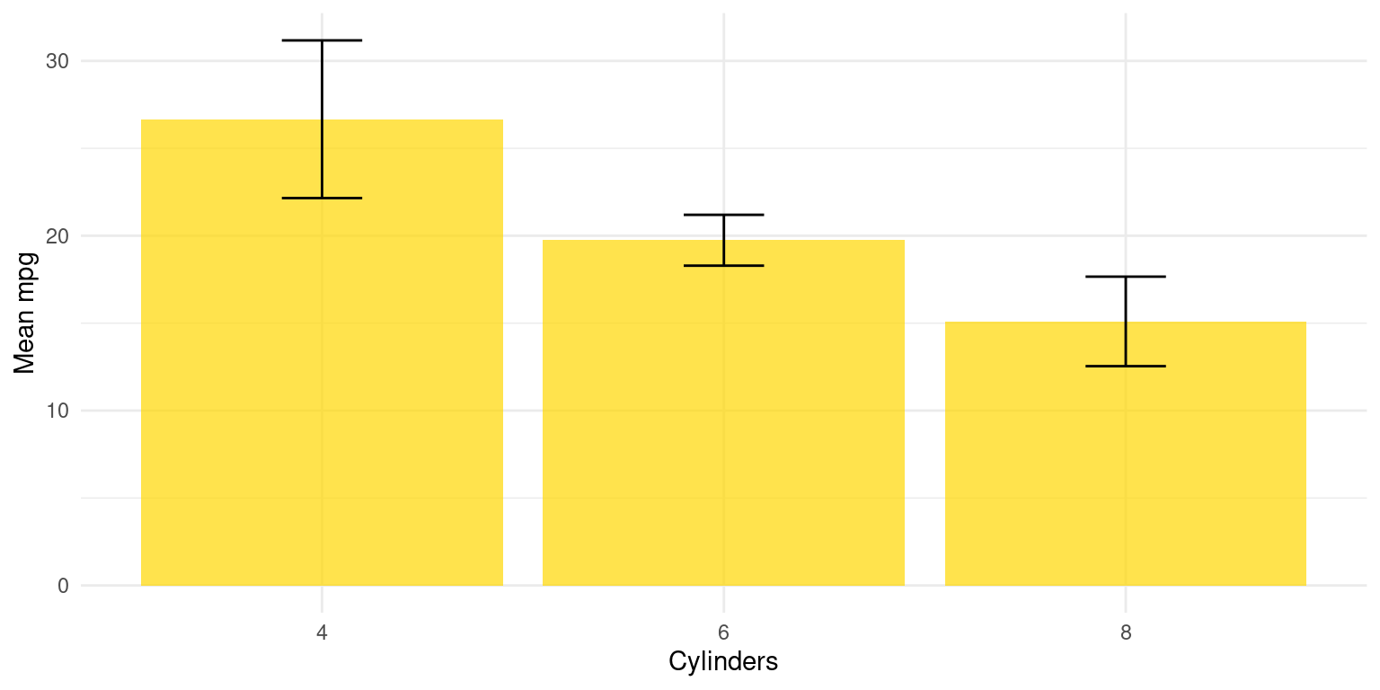
- Discussion:
ggplot(s1, aes(x = cyl, y = Mean_mpg)): Theggplot()function initializes a ggplot object. It’s specifying the data to use (s1data frame) and mapping aesthetic elements to variables in the data. Here,aes(x = cyl, y = Mean_mpg)specifies that the x-axis representscyl(number of cylinders) and the y-axis representsMean_mpg(mean miles per gallon).geom_bar(stat = "identity", fill = "skyblue", alpha = 0.7): Thegeom_bar()function is used to create a bar chart. Settingstat = "identity"indicates that the heights of the bars represent the values in the data (in this case,Mean_mpg). Thefill = "skyblue"argument sets the color of the bars to sky blue, andalpha = 0.7sets the transparency of the bars.geom_errorbar(aes(ymin = Mean_mpg - SD_mpg, ymax = Mean_mpg + SD_mpg), width = .2): Thegeom_errorbar()function adds error bars to the plot. The argumentsaes(ymin = Mean_mpg - SD_mpg, ymax = Mean_mpg + SD_mpg)set the bottom (ymin) and top (ymax) of the error bars to represent one standard deviation below and above the mean, respectively.width = .2sets the horizontal width of the error bars.labs(x = "Cylinders", y = "Mean mpg"): Thelabs()function is used to specify the labels for the x-axis and y-axis.theme_minimal(): Thetheme_minimal()function is used to set a minimalistic theme for the plot.This plot provides a clear visual representation of the mean miles per gallon for different numbers of cylinders, with the variation in each group indicated by the error bars.
- We extend this code to demonstrate how to measure the bivariate relationships between multiple continuous variables from the mtcars data and the categorical variable number of Cylinders (
cyl), usingggplot2. Specifically, we consider the continuous variables (i) Miles Per Gallon (mpg); (ii) Weight (wt); (iii) Horsepower (hp) across the number of Cylinders (cyl).
library(dplyr)
s3 <- tb %>%
  group_by(cyl) %>%
  summarise(
    Mean_mpg = mean(mpg, na.rm = TRUE),
    SD_mpg = sd(mpg, na.rm = TRUE),
    Mean_wt = mean(wt, na.rm = TRUE),
    SD_wt = sd(wt, na.rm = TRUE),
    Mean_hp = mean(hp, na.rm = TRUE),
    SD_hp = sd(hp, na.rm = TRUE)
    )
print(s3)
# A tibble: 3 × 7
cyl Mean_mpg SD_mpg Mean_wt SD_wt Mean_hp SD_hp
<fct> <dbl> <dbl> <dbl> <dbl> <dbl> <dbl>
1 4 26.7 4.51 2.29 0.570 82.6 20.9
2 6 19.7 1.45 3.12 0.356 122. 24.3
3 8 15.1 2.56 4.00 0.759 209. 51.0- Discussion:
With
tb %>%, we indicate that we are going to perform a series of operations on thetbdata frame. The next operation isgroup_by(cyl), which groups the data by thecylvariable.The
summarise()function is then used to create a new data frame that summarizes the grouped data. Insidesummarise(), we calculate the mean and standard deviation (SD) of three variables (mpg,wt, andhp). Thena.rm = TRUEargument insidemean()andsd()functions is used to exclude any NA values from these calculations.The resulting calculations are assigned to new variables (
Mean_mpg,SD_mpg,Mean_wt,SD_wt,Mean_hp, andSD_hp) which will be the columns in the summarised data frame. The summarised data will contain one row for each group (in this case, each unique value ofcyl), and columns for each of the summary statistics.To summarize, this script groups the data in the
tbtibble bycyland then calculates the mean and standard deviation of thempg,wt, andhpvariables for each group. [1]
Across two Categories using ggplot2
- We demonstrate the relationship between Miles Per Gallon (
mpg) and Cylinders (cyl) and Transmission type (am) usingggplot2. Recall that a car’s transmission may be automatic (am=0) or manual (am=1).
library(dplyr)
tb_grouped <- tb %>%
  group_by(cyl, am) %>%
  summarise(Mean_mpg = mean(mpg, na.rm = TRUE),
            SD_mpg = sd(mpg, na.rm = TRUE))
`summarise()` has grouped output by 'cyl'. You can override using the `.groups`
argument.tb_grouped# A tibble: 6 × 4
# Groups: cyl [3]
cyl am Mean_mpg SD_mpg
<fct> <fct> <dbl> <dbl>
1 4 0 22.9 1.45
2 4 1 28.1 4.48
3 6 0 19.1 1.63
4 6 1 20.6 0.751
5 8 0 15.0 2.77
6 8 1 15.4 0.566- Discussion:
In the above code, we are grouping by both
cylandambefore summarizing. This will provide the mean and standard deviation ofmpgfor each unique combination ofcylandam.Here is how it can be visualized:
# Create the plot
ggplot(tb_grouped, aes(x = interaction(cyl, am), y = Mean_mpg, fill = as.factor(am))) +
  geom_bar(stat = "identity",
           alpha = 0.7,
           position = position_dodge()) +
  geom_errorbar(aes(ymin = Mean_mpg - SD_mpg,
                    ymax = Mean_mpg + SD_mpg),
                width = .2,
                position = position_dodge(.9)) +
  labs(x = "Cylinders and Transmission", y = "Mean mpg", fill = "Transmission") +
  theme_minimal()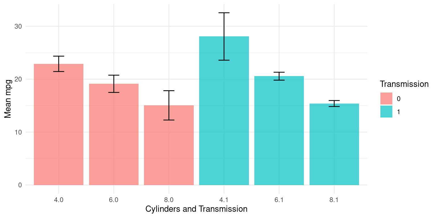
- In the below code, the order of the variables is reversed - the data is first grouped by
am, then bycyl. So, the function first sorts the data by theamvariable, and within eachamgroup, it further groups the data bycyl.
library(dplyr)
tb_grouped2 <- tb %>%
  group_by(am, cyl) %>%
  summarise(Mean_mpg = mean(mpg, na.rm = TRUE),
            SD_mpg = sd(mpg, na.rm = TRUE))
`summarise()` has grouped output by 'am'. You can override using the `.groups`
argument.- Here is how it can be visualized:
# Create the plot
ggplot(tb_grouped2, aes(x = interaction(am, cyl), y = Mean_mpg, fill = as.factor(cyl))) +
  geom_bar(stat = "identity",
           alpha = 0.7,
           position = position_dodge()) +
  geom_errorbar(aes(ymin = Mean_mpg - SD_mpg,
                    ymax = Mean_mpg + SD_mpg),
                width = .2,
                position = position_dodge(.9)) +
  labs(x = "Transmission and Cylinders", y = "Mean mpg", fill = "Cylinders") +
  theme_minimal()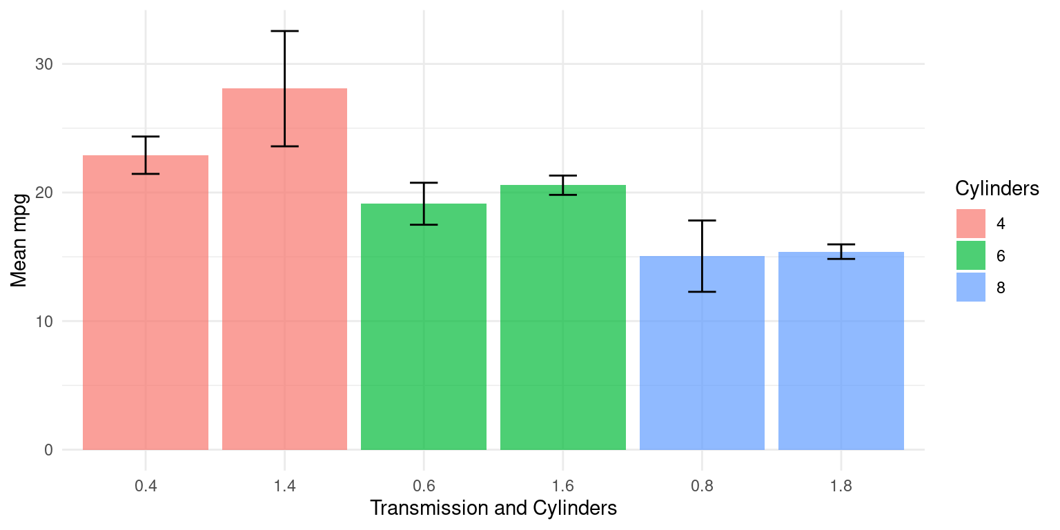
- The following code produces a new data frame that contains the mean and standard deviation of the continuous variables
mpg,wt, andhpfor each combination of the factor variablesamandcyl. [1]
library(dplyr)
tb %>%
  group_by(am, cyl) %>%
  summarise(
    Mean_mpg = mean(mpg, na.rm = TRUE),
    SD_mpg = sd(mpg, na.rm = TRUE),
    Mean_wt = mean(wt, na.rm = TRUE),
    SD_wt = sd(wt, na.rm = TRUE),
    Mean_hp = mean(hp, na.rm = TRUE),
    SD_hp = sd(hp, na.rm = TRUE)
    )
`summarise()` has grouped output by 'am'. You can override using the `.groups`
argument.# A tibble: 6 × 8
# Groups: am [2]
am cyl Mean_mpg SD_mpg Mean_wt SD_wt Mean_hp SD_hp
<fct> <fct> <dbl> <dbl> <dbl> <dbl> <dbl> <dbl>
1 0 4 22.9 1.45 2.94 0.408 84.7 19.7
2 0 6 19.1 1.63 3.39 0.116 115. 9.18
3 0 8 15.0 2.77 4.10 0.768 194. 33.4
4 1 4 28.1 4.48 2.04 0.409 81.9 22.7
5 1 6 20.6 0.751 2.76 0.128 132. 37.5
6 1 8 15.4 0.566 3.37 0.283 300. 50.2 Visualizing Continuous Data using ggplot2
Let’s take a closer look at some of the most effective ways of visualizing continuous data, across one Category, using ggplot2, including
Histograms, using ggplot2;
PDF and CDF Density plots, using ggplot2;
Box plots, using ggplot2;
Bee Swarm plots, using ggplot2;
Violin plots, using ggplot2;
Q-Q plots, using ggplot2.
Histograms across one Category using ggplot2
Visualizing histograms of car milegage (mpg) broken down by transmission (am=0,1)
ggplot(tb, aes(x = mpg,
               fill = am)) +
  geom_histogram(binwidth = 5, color = "black") +
  scale_fill_manual(values = c("gold", "lightblue")) +
  theme_minimal() +
  labs(title = "Histogram of Miles Per Gallon (mpg) by Transmission Type (am)",
       x = "Miles Per Gallon (mpg)",
       y = "Frequency")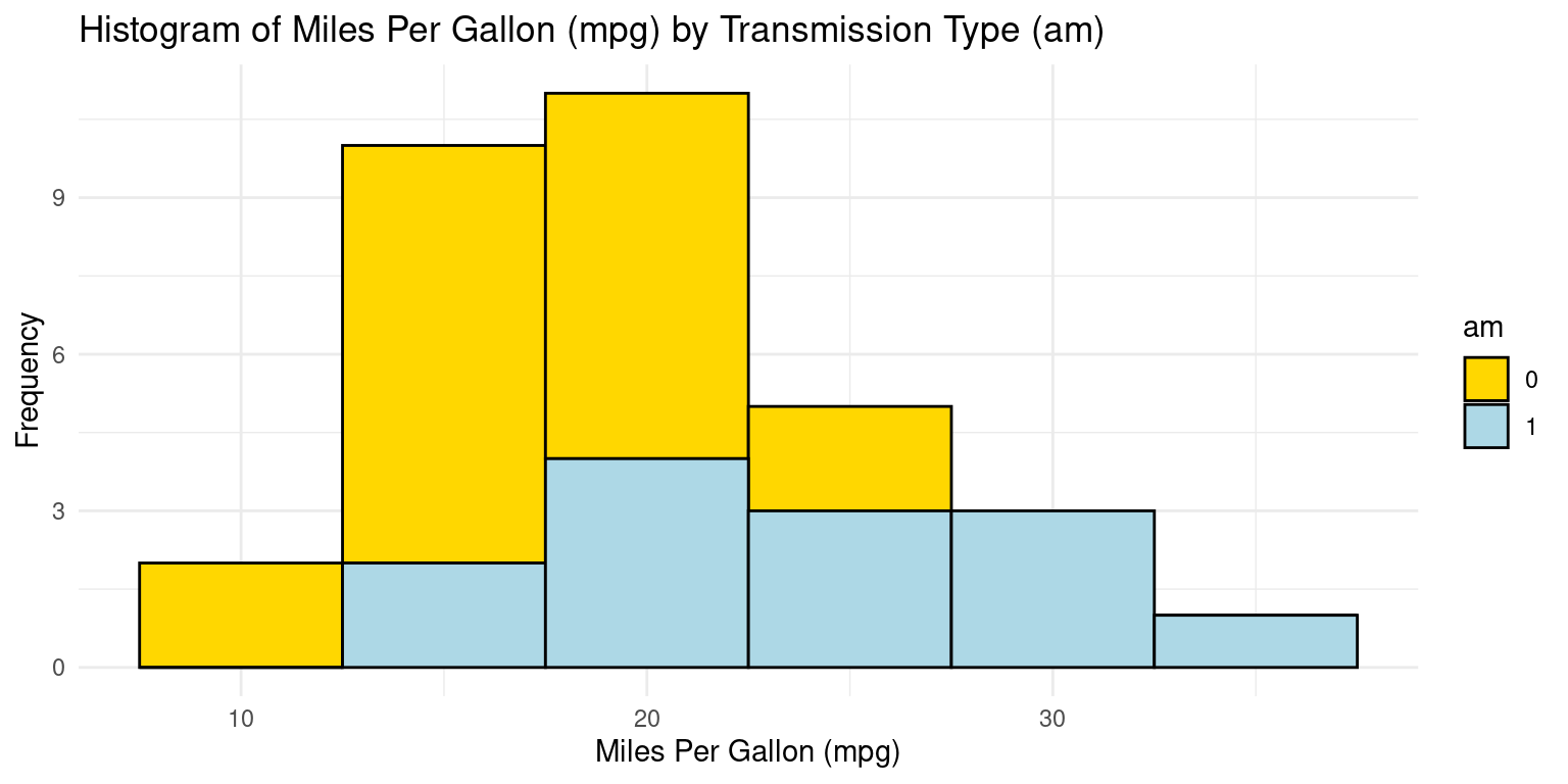
- If we want separate histograms, we can set facet_wrap(~ am)
ggplot(tb, aes(x = mpg,
               fill = am)) +
  geom_histogram(binwidth = 5, color = "black") +
  scale_fill_manual(values = c("gold", "lightblue")) +
  facet_wrap(~ am) +
  theme_minimal() +
  labs(title = "Histogram of Miles Per Gallon (mpg) by Transmission Type (am)",
       x = "Miles Per Gallon (mpg)",
       y = "Frequency")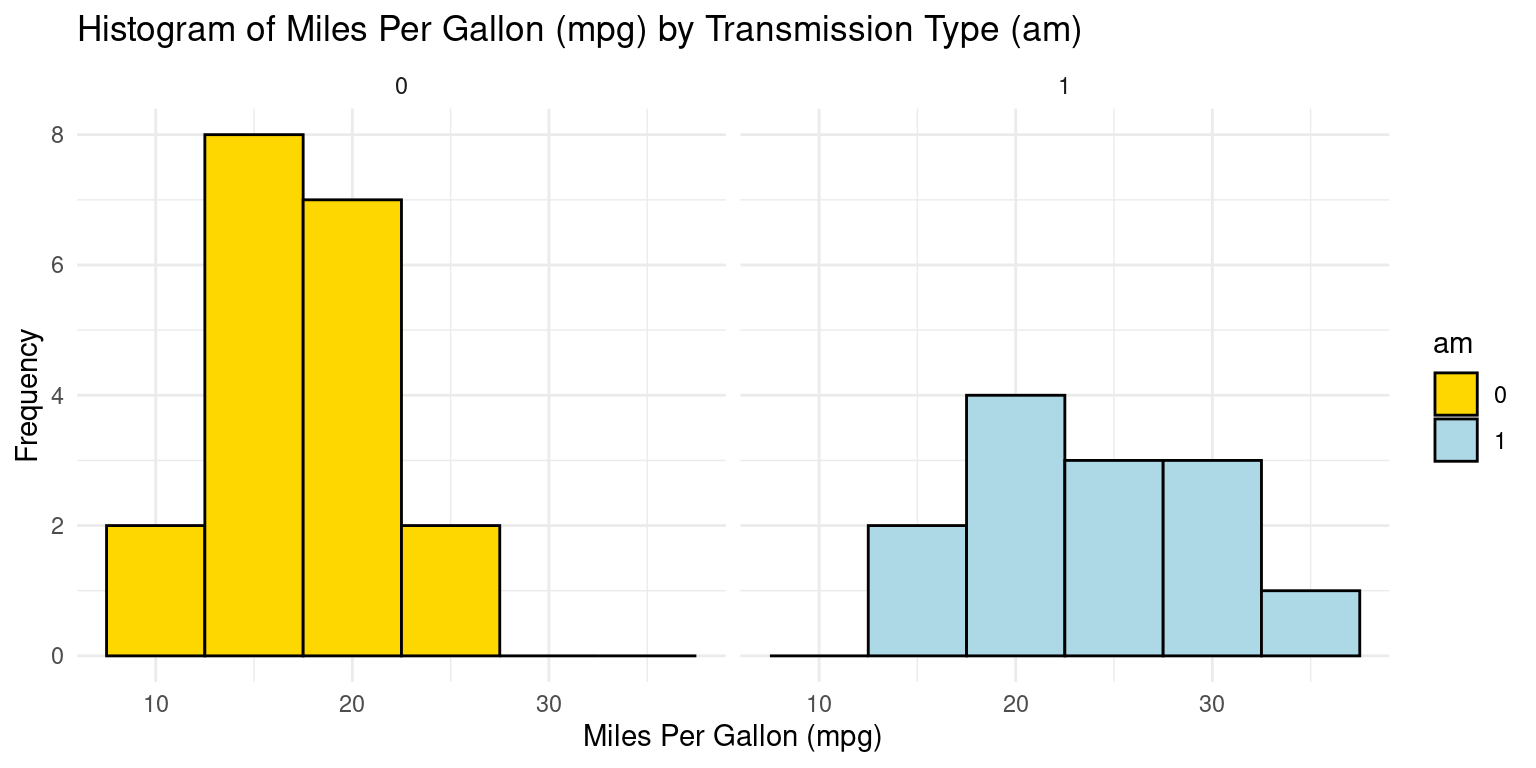
Histogram across one Category using ggpubr
library(ggpubr)
gghistogram(tb,
            x = "mpg",
            bins = 6,
            add = "mean",
            rug = TRUE,
            color = "am",
            fill = "am",
            alpha = 0.8,
            palette = c("gold", "lightblue"))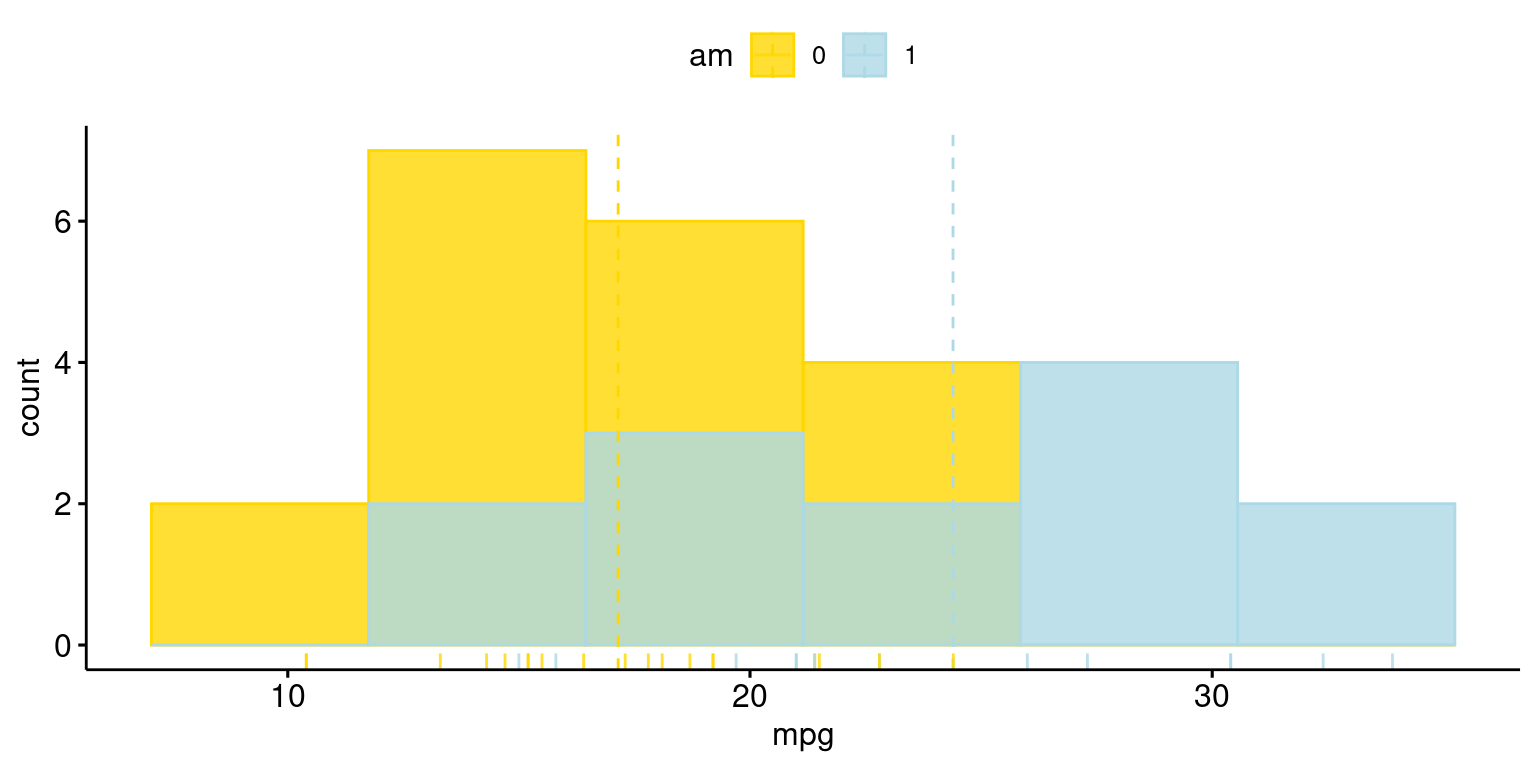
Histograms across two Categories using ggplot2
Visualizing histograms of car milegage (mpg) broken down by transmission (am=0,1) and cylinders (cyl=4,6,8)
ggplot(tb, aes(x = mpg,
               fill = am)) +
  geom_histogram(binwidth = 3, color = "black") +
  scale_fill_manual(values = c("gold", "lightblue")) +
  facet_grid(cyl ~ am) +
  theme_minimal() +
  labs(title = "Histogram of Miles Per Gallon (mpg) by Transmission Type (am=0,1) and Cylinder (cyl=4,6,8)",
       x = "Miles Per Gallon (mpg)",
       y = "Frequency")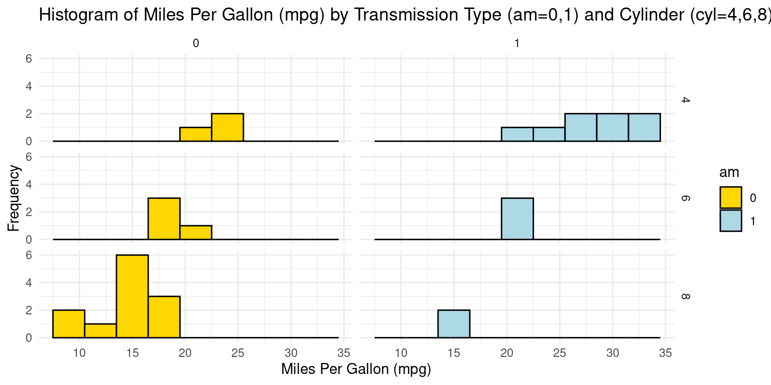
PDF across one Category using ggplot2
ggplot(tb, aes(x = mpg,
               fill = am)) +
  geom_density(color = "black") +
  scale_fill_manual(values = c("gold", "lightblue")) +
  facet_wrap(~ am) +
  theme_minimal() +
  labs(title = "Density Plot of Miles Per Gallon (mpg) by Transmission Type (am)",
       x = "Miles Per Gallon (mpg)",
       y = "Density")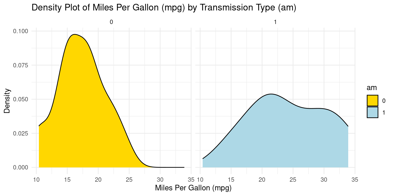
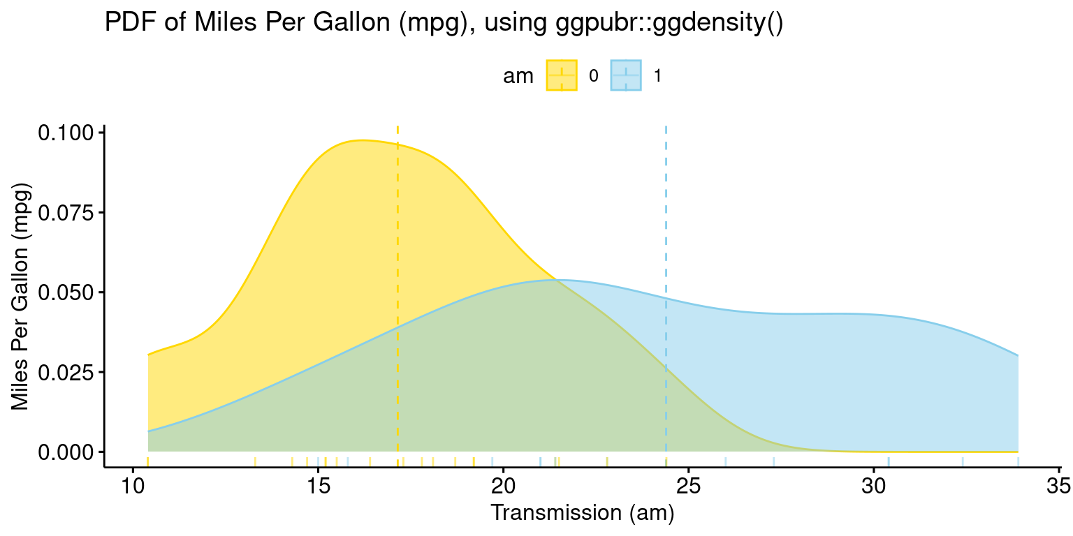
PDF across one Category using ggpubr
- The provided R code creates a Boxplot of the
mpg(miles per gallon) variable in thetbdataset, using theggboxplot()function from theggpubrpackage.
library(ggpubr)
ggdensity(tb,
          x = "mpg",
          color = "am" ,
          fill = "am",
          add = "mean",
          rug = TRUE,
          palette = c("gold", "skyblue"),
          title = "PDF of Miles Per Gallon (mpg), using ggpubr::ggdensity()",
          ylab = "Miles Per Gallon (mpg)",
          xlab = "Transmission (am)"
)
CDF across one Category using ggplot2
library(ggplot2)

# Create separate CDFs for 'am = 0' and 'am = 1'
ggplot(tb, aes(x = mpg,
               color = factor(am))) +
  stat_ecdf(geom = "line") +
  scale_color_manual(values = c("blue", "black")) +
  labs(x = "Miles Per Gallon (mpg)", y = "CDF",
       title = "Cumulative Distribution Function (CDF) of Mileage (mpg) for Transmission (am)",
       color = "am") +
theme_minimal() 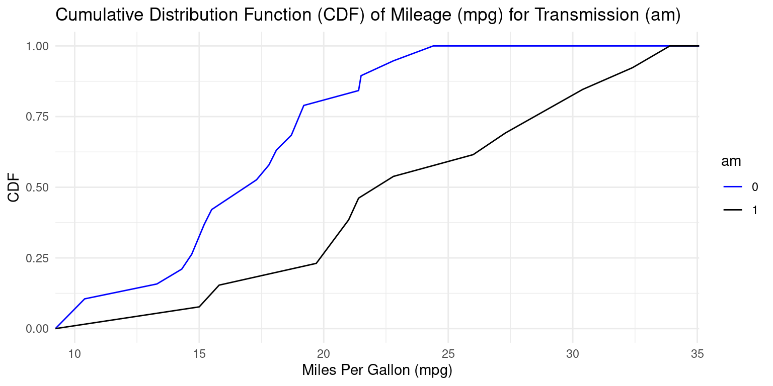
Box Plot across one Category using ggplot2
Visualizing Median using Box Plot – median weight of the cars broken down by cylinders (cyl=4,6,8)
library(ggplot2)

ggplot(tb, aes(x = cyl,
               y = mpg)) +
  geom_boxplot(fill = c("gold","lightblue","lightpink"),
               color = "black") +
  coord_flip() +
  labs(title = "Boxplot of Miles Per Gallon (mpg) by Cylinders",
       y = "Miles Per Gallon (mpg)",
       x = "Cylinders") +
  theme_minimal()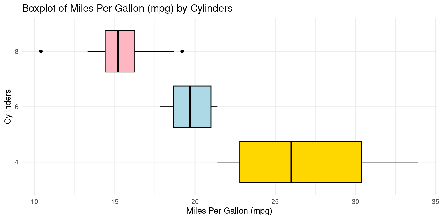
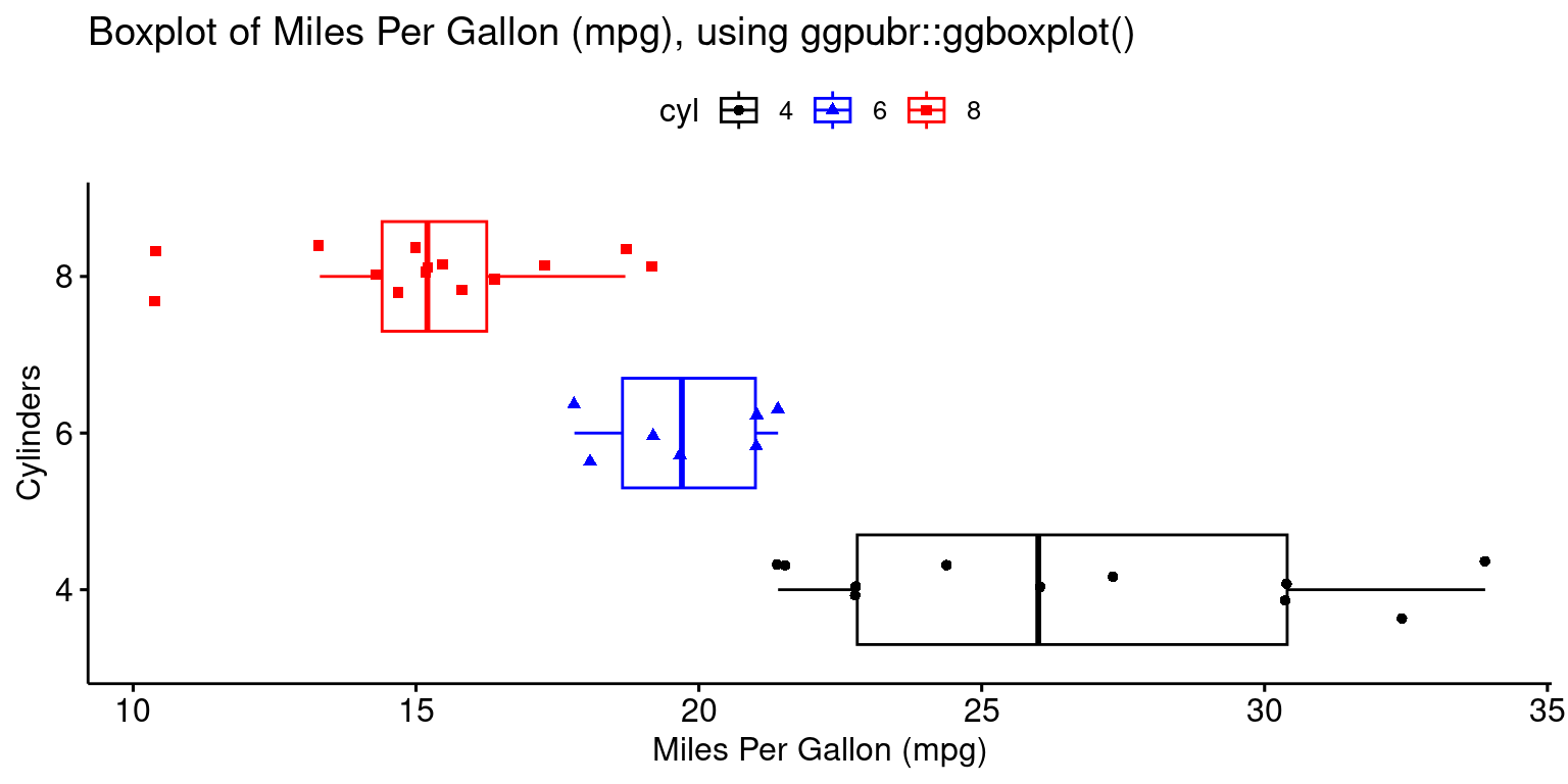
Box Plot across one Category using ggpubr
- The provided R code creates a Boxplot of the
mpg(miles per gallon) variable in thetbdataset, using theggboxplot()function from theggpubrpackage.
library(ggpubr)
ggboxplot(tb,
          y = "mpg",
          x = "cyl",
          color = "cyl",
          fill = "white",
          palette = c("black","blue","red"),
          shape = "cyl",
          orientation = "horizontal",
          add = "jitter", #jitter helps display the data points
          title = "Boxplot of Miles Per Gallon (mpg), using ggpubr::ggboxplot()",
          ylab = "Miles Per Gallon (mpg)",
          xlab = "Cylinders"
)
Box Plot across two Categories using ggplot2
ggplot(tb, aes(x = as.factor(am), y = mpg, fill = as.factor(am))) +
  geom_boxplot() +
  scale_fill_manual(values = c("gold", "lightblue"), name = "Transmission") +
  facet_grid(~ cyl) +
  theme_minimal() +
  labs(title = "Boxplot of Mileage (mpg) by Cylinders (cyl=4,6,8) and Transmission (am=0,1)",
       x = "Transmission Type (am)",
       y = "Miles Per Gallon (mpg)")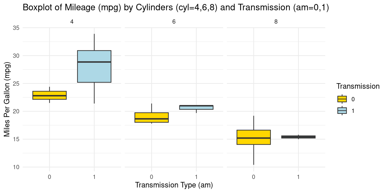
Alternately:
ggplot(tb, aes(x = as.factor(cyl), y = mpg, fill = as.factor(cyl))) +
  geom_boxplot() +
  scale_fill_manual(values = c("gold", "lightblue", "lightpink"), name = "Cylinders") +
  facet_grid(~ am) +
  theme_minimal() +
  labs(title = "Boxplot of Mileage (mpg) by Transmission (am=0,1) and Cylinders (cyl=4,6,8)",
       x = "Number of Cylinders (cyl)",
       y = "Miles Per Gallon (mpg)")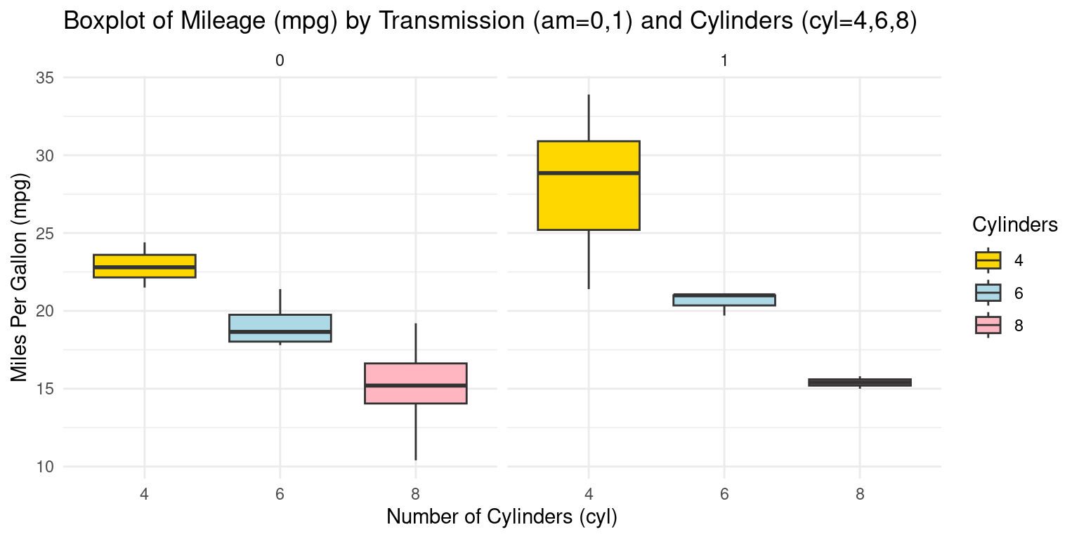
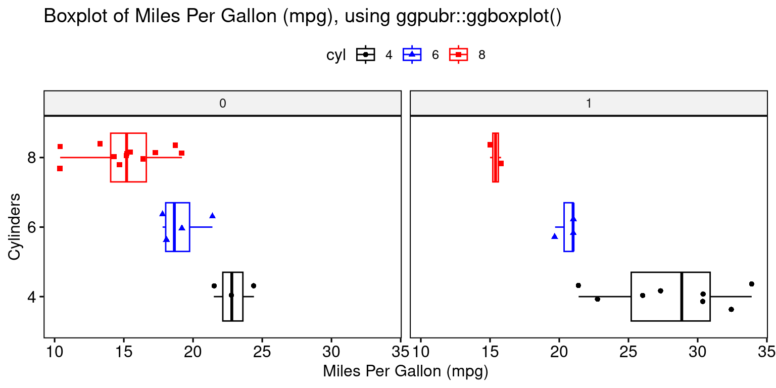
Box Plot across two Categories using ggpubr
library(ggpubr)
ggboxplot(tb,
          y = "mpg",
          x = "cyl",
          color = "cyl",
          fill = "white",
          palette = c("black","blue","red"),
          shape = "cyl",
          orientation = "horizontal",
          add = "jitter", #jitter helps display the data points
          facet.by = "am", #split data by "am"
          title = "Boxplot of Miles Per Gallon (mpg), using ggpubr::ggboxplot()",
          ylab = "Miles Per Gallon (mpg)",
          xlab = "Cylinders"
)
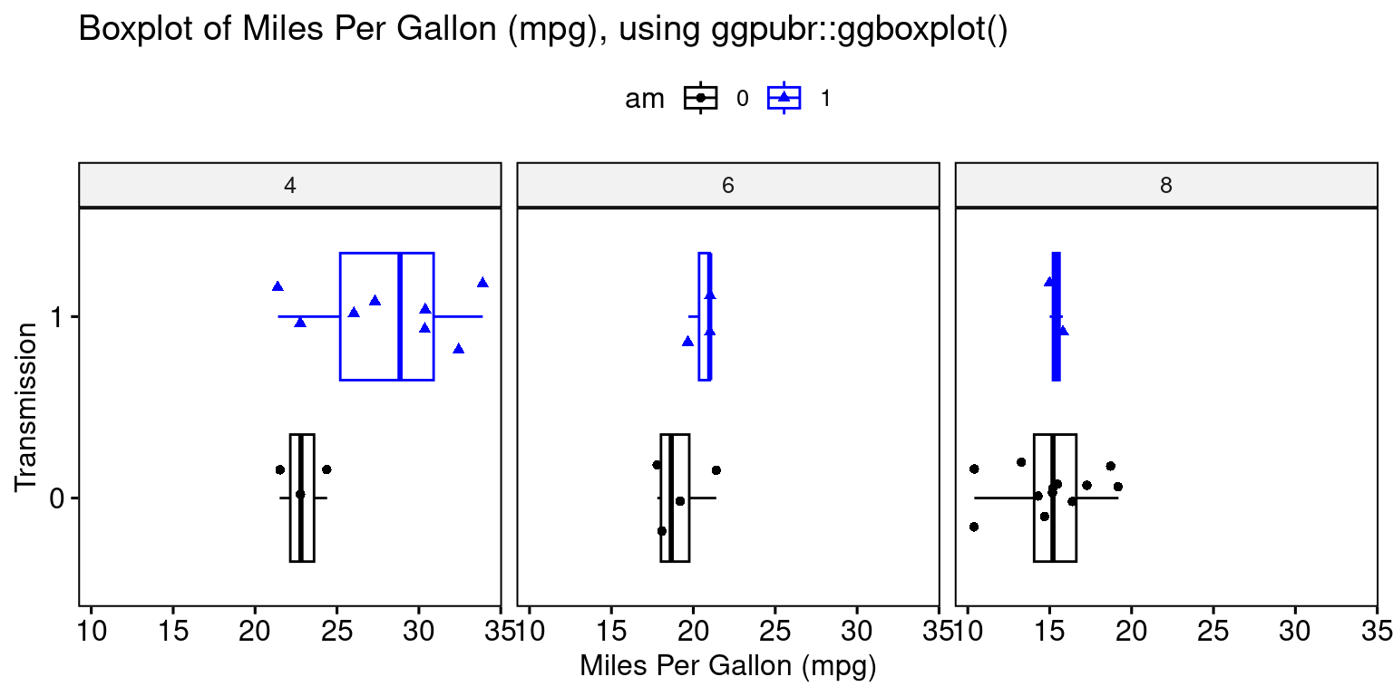
library(ggpubr)
ggboxplot(tb,
          y = "mpg",
          x = "am",
          color = "am",
          fill = "white",
          palette = c("black", "blue"),  # assuming am has 2 levels; adjust as needed
          shape = "am",
          orientation = "horizontal",
          add = "jitter", #jitter helps display the data points
          facet.by = "cyl", #split data by "cyl"
          title = "Boxplot of Miles Per Gallon (mpg), using ggpubr::ggboxplot()",
          ylab = "Miles Per Gallon (mpg)",
          xlab = "Transmission"
)
Bee Swarm Plot across one Category using ggbeeswarm
Visualizing Median using Box Plot – median weight of the cars broken down by cylinders (cyl=4,6,8)
library(ggplot2)
library(ggbeeswarm)
# Create the beeswarm plot
ggplot(mtcars,
       aes(x = factor(cyl),
           y = mpg)) +
  geom_beeswarm() +
  labs(title = "Bee Swarm plot of Miles Per Gallon (mpg) by Cylinders",
       x = "Cylinders (cyl)",
       y = "Mileage (mpg)") +
  theme_minimal() +
  theme(panel.background = element_rect(fill = "lightblue"))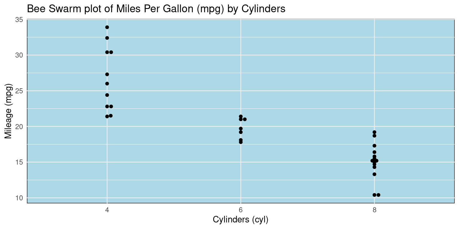
Violin Plot across one Category using ggplot2
Visualizing using Violin Plot – distribution of mpg of the cars broken down by cylinders (cyl=4,6,8)
library(ggplot2)

ggplot(tb, aes(x = factor(cyl),
               y = mpg)) +
  geom_violin(aes(fill = factor(cyl)),
              color = "black") +
  scale_fill_manual(values = c("gold","lightblue","lightpink"),
                    name = "Cylinders") +
  coord_flip() +
  labs(title = "Violin plot of Miles Per Gallon (mpg) by Cylinders",
       y = "Miles Per Gallon (mpg)",
       x = "Cylinders") +
  theme_minimal()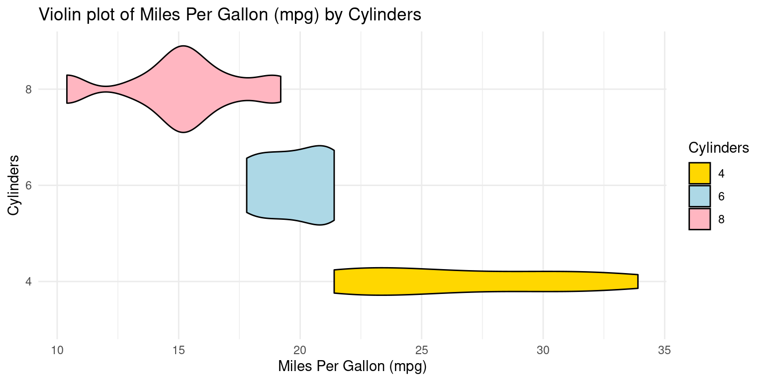
We can embed boxplots within the above Violin plots, as follows.
library(ggplot2)

ggplot(tb, aes(x = factor(cyl),
               y = mpg)) +
  geom_violin(aes(fill = factor(cyl)),
              color = "black") +
  scale_fill_manual(values = c("gold","lightblue","lightpink"),
                    name = "Cylinders") +
  geom_boxplot(width=0.2,
               fill="white") +
  coord_flip() +
  labs(title = "Violin plot of Miles Per Gallon (mpg) by Cylinders",
       y = "Miles Per Gallon (mpg)",
       x = "Cylinders") +
  theme_minimal()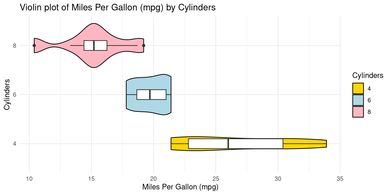
References
[1]
Wickham, H., François, R., Henry, L., & Müller, K. (2021). dplyr: A Grammar of Data Manipulation. R package version 1.0.7. https://CRAN.R-project.org/package=dplyr
Wickham, H. (2016). ggplot2: Elegant Graphics for Data Analysis. Springer-Verlag New York. ISBN 978-3-319-24277-4, https://ggplot2.tidyverse.org.
[2]
Kassambara A (2023). ggpubr: ‘ggplot2’ Based Publication Ready Plots. R package version 0.6.0, https://rpkgs.datanovia.com/ggpubr/.